So I really want to do hologram mise-en-scene. Turns out it's way harder than I thought. I won't go super into detail, however, I'm rather disappointed with the result. There was no glow no matter how much I fiddled around with the setting and the result ended up being... disappointing. But that's ok. I really didn't like the result of my attempt but I think it's important to not only share my good work, but also my mistakes.
I love fonts! Dafont.com and I have been good friends since way before this project. So I revisited my old friend and got to scrolling! And then I realized there's a lot of copyright information that I really don't want to mess up. So I went to Adobe Fonts since I knew there'd be no problems there. Dafont.com will be returned to once I've exhausted my resources at Adobe!
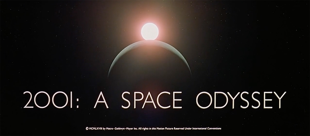
First, I've considered Futura. Duh, I know. It's basically the bread and butter or sci-fi fonts. But it's for a reason! I remembered watching a really cool and interesting video by Vox on the font, which I'm going to leave below!
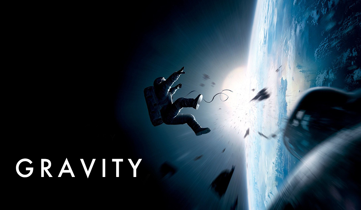
Anyways, 2001: A Space Odessey, Gravity, and Interstellar all use this font. Because it's a good font! Definitely putting it under consideration.
Another one used by Kubrik is Gill Sans Nova. I'm not sure if it'll fit in with our movie, but I won't knock it until I try it!
The rest of the fonts don't have much background behind them, but I did enjoy how they looked.
I went back to Dafont.com and found some fonts I really enjoyed. I emailed the creator of the Qualy font to ask permission for the use of his font. I'll update this as necessary with the response.
I also found Ijskelder which is really cool as well. It's a much different vibe. I also contacted this creator to see if I'd have permission to use it.
No working title just yet, but I'll put up a post with all the working title and the fonts later. No choice will be made today, so, stay tuned!
So, Veronica agreed to be our actress! We'll be coordinating times for filming later. Her boyfriend, Jackson, agreed to let me take pictures of him to use for the fake dating app we'll be featuring in the video. I'll obviously have to ask for more people to photograph, but I know that Gus, who was featured in my hologram try-out video, would be on board.
Scriptwriting is going to happen this weekend, and I'm really excited. I'll make sure to upload my process and the final result for everyone to read. I'm unsure when I'll do the storyboard, but it'll definitely be after I go over the script a few times.
Robert is going to ask around his friends for more people to photograph, so I'm sure we'll have more than enough people to get the job done.
Anyways... onto the costumes! Shoes are really expensive so we're planning on Veronica getting her own or using a pair she already owns. We don't have the budget for $40 shoes in our wallets, and I don't think my mom would appreciate me putting it on a credit card, even if I return it. But, we'll be getting Veronica's dress! We chose to get it on Amazon due to their more than generous return policy. We originally planned to go thrifting for the costumes, but we realized that finding a 50s era dress that both fits the vibe we're trying to accomplish AND fits Veronica will be rather tough. So we'll go thrifting for props and let Amazon handle the rest.
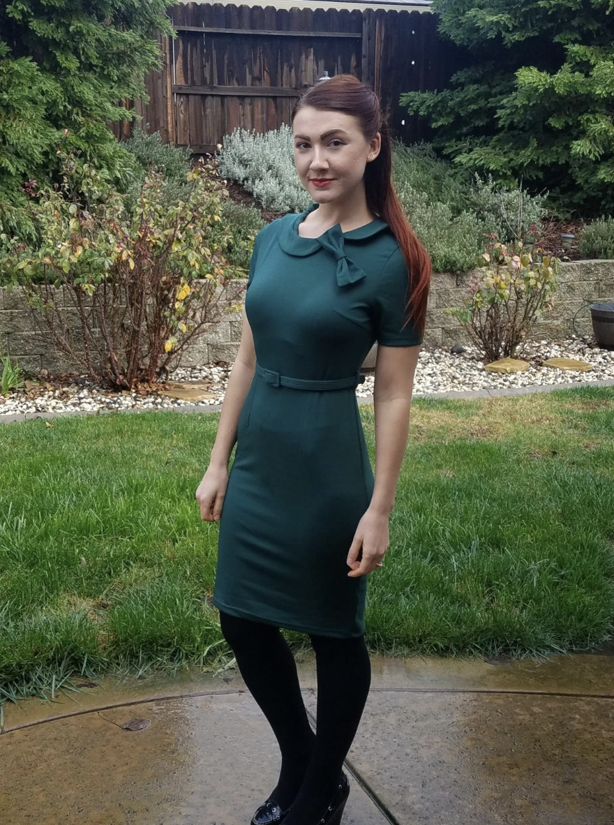
This is one of the dresses I had in mind. I think the color of the first would make our protagonist look homey and welcoming. The second color would fit pretty well into one of our color palettes, though (in case you forgot). The best part about them is the free returns.
One of the reviewers uploaded a picture of her wearing the dress. It looks really cool! It definitely feels like it doesn't belong in our decade. However, the discrepancy in sleeve length worries me slightly. I like how she styled it with opaque black leggings and we might adopt the idea ourselves.
I'm gonna meet with Veronica and get her opinion, especially since she'll be the one wearing the costume. We want to make sure that she feels comfortable in the costume we give her.
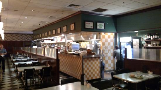
Robert and I got to thinking about where we would film. Sure, we could film in a bedroom, but that would require a good amount of cleanup in order to get it to look retro. In addition, it would be much harder to find retrofuturistic mise-en-scene to turn my room, or Robert's, or our actress's into something that would realistically work. Sure, there's nothing "real" about the world we're creating, but we want to make it look as if we're actually in the future that looks like the past.
So there was only one thing I could do.
Turns out I was completely forgetting that Weston, where Robert and I live, has a retro-themed diner! It's called Lucille's and would require minimal hassle to get to. (Our music video set in Las Olas was rather complicated to organize).
I DID IT! I followed the tutorial and it made a pretty cool end result! Of course, this isn't super professional, but that was never the intention. This was just to make sure I was able to do the effect. I'm really pleased with it, though.
I know that the hologram and the swiping motions don't match, but the tutorial does explain how to do so. I might make a blog post in the future to show off this skill, though.
I was told that I should make the hologram red because red is a love color/the color of passion. While I don't really like the idea of a red hologram because it screams evil villain, I did change the hologram to be red to check it out.
Again, don't love it. But I'll put up a poll online to see which my friends like better. I think peer feedback would be especially useful for this decision.
We want to start with our character getting ready for a date. We want to incorporate the use of holograms in the scene through a video chat with a friend and the character going through a dating app (I'll have some mockups of the futuristic dating app up on the blog soon!). They'll finish putting their makeup on while the dialogue helps establish the plot and setting.
I found this video tutorial for how to make holograms in Premiere Pro (the editing program I will be using), so I plan on doing a few test runs to make sure I'm able to actually do this hologram concept before we actually fully commit to it.
Robert is going to go amongst his friends and ask who wants to be in our movie and who is willing to have pictures taken of them in order for us to use in the fake dating app.
I think I'll write the script while I'm away this weekend. I'm pretty excited!
I feel like an aspect of film that is often overlooked by amateurs is makeup. Lucky for me, I have way too much makeup and I will jump at literally any opportunity to use it. So I got to researching types of makeup I could do for our film!
These pair of looks inspired the next following ones I made. Basically, I'm just going to show a very sped-up video of me applying the makeup and then a final look of what I came up with. So prepare for some mediocre makeup looks!
Yes, I heavily fixed the eyeshadow and the lipstick. No! We're not gonna talk about it! I softened up the lipstick heavily and gave it more of a blotted look since it was a MESS before. But I kind of like how the eyes turned out! I would maybe add crystals in order to make it more "futuristic". I'll link the ones I'm thinking of below.
Once again, I fixed the eyeshadow shape and softened the lipstick. I'll probably throw this lipstick out because it sucked! It looked so streaky on and would look bad with a camera that has any kind of decent quality. But, there are good things! I think using a glitter highlight is super fun and ~futuristic~ and I just liked it. I think this combined with maybe something more abstract could lead to a cool SciFi look.
Are my eyes irritated and is there glitter all over my face? The answer to both of those questions is yes. So that's where I'm gonna leave off for today! I'll pick it right back up tomorrow with more traditional and maybe I'll throw in an abstract look... or 5. We'll see what my eyes are up to! ;)
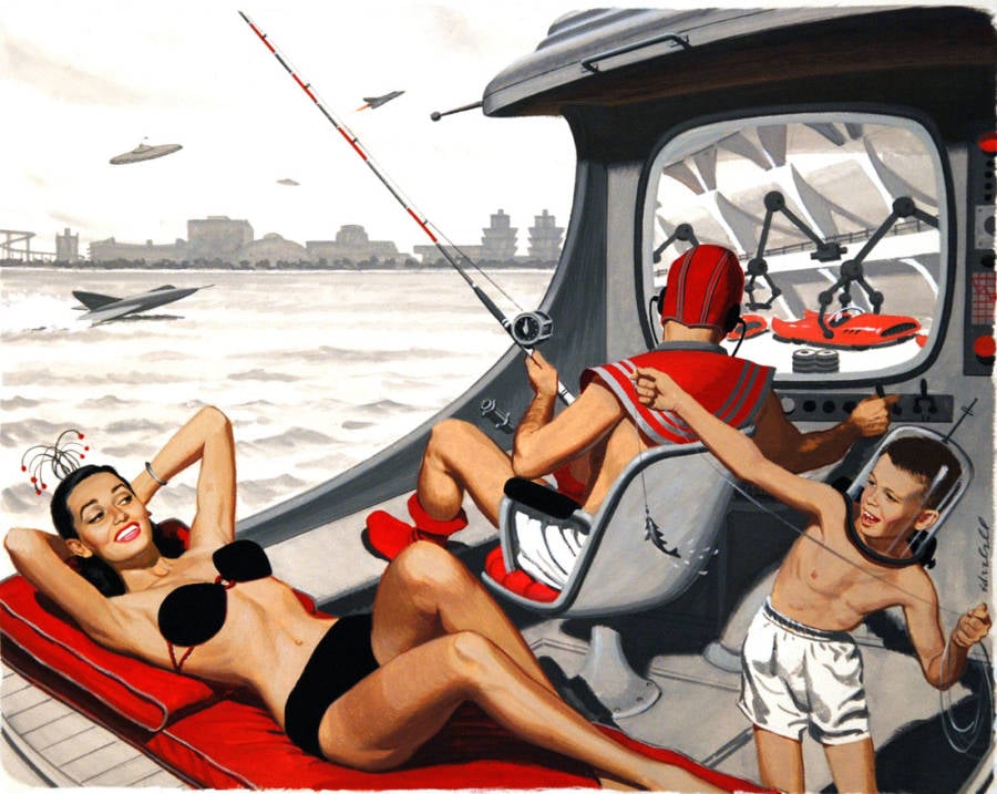
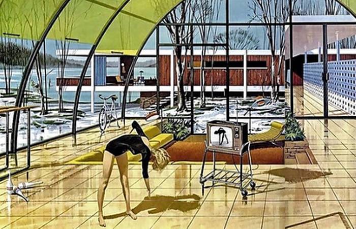
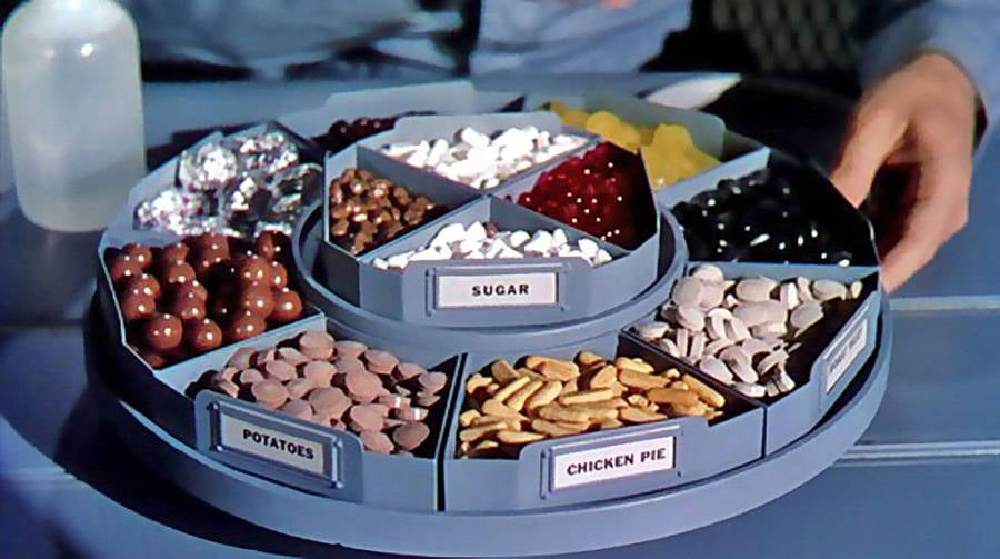
Retrofuturism is essentially an art movement that portrays the future through the lens of the past. It envisions our future technologies as basically an advanced modification of previous ones. Considering that this movement likes exploring the contrast between past and future (I know I sound repetitive, please bear with me) I thought it would be perfect for our subject.
What a better way to critique modern romance than to juxtapose it with the looks of an era where women were locked away in the kitchen? Putting daily hookups in a setting that screams "What do you mean you're getting divorced? No one does that!"
As Wikipedia aptly puts it: "Retrofuturism incorporates two overlapping trends which may be summarized as the future as seen from the past and the past as seen from the future." One way retrofuturism can be interpreted is by directly taking pre-1960s ideas of what the future would look like. Plenty of artists dating back to the 1800s had envisioned some form of the future based on their present. So a way to channel this artform is by taking inspiration from, essentially, the source. Another way to interpret retrofuturism is to take the future and incorporate aspects of the past. You take modernity and make it look old. Steampunk takes modern technology and makes it look Victorian, for example.
Whichever way we decide to do it, it'll probably end up looking similar to if we did it the other way.
One thing that I really enjoy about this art movement is that it's meant to show dissatisfaction with the present. Our idea is going to fit perfectly into the genre! I'm so excited.
Below is a compilation of videos I binge-watched in order to get a better grasp of the genre. More blog posts to come soon!
As I saw while researching, retro-futurism has some cool color palettes that range from pastels to greyscale with pops of color. In order to keep track of some color palettes that I want to possibly incorporate, I decided to share them on my blog (in no particular order!)
I used the website Coolors.co due to the ease of use and the randomness! I could choose a palette that spoke to me instead of agonizing over whether I chose the right colors that cohesively went together. It really streamlined the process.
I really like the pastel greens in this palette. The pink, purple, and peach aren't super in line with what I thought of, but I think they go quite well together
I love the reds in this palette! I feel like the use of red would be really cool. It would provide maybe an apocalyptic vibe while also incorporating the color of love into our color palette.
This is what I think of when I think of sci-fi! I would love to incorporate the green on the far right into our movie. It reminds me of both of the genre and of a 1950s housewife's dress. Which is the whole point, isn't it?
This is a brighter and more pastel version of the last one, essentially. While I like this one a lot, the other one feels more appropriate for our aimed aesthetic. However, I still want to keep this here because I think it does add an aspect the other palette doesn't that I may want to incorporate.
The red does the same, it reminds me a lot of a 1950s housewife's dress with that red. The other colors look clean and provide a vibe I think we could channel into our movie.
A return to warm colors! I felt like the past few were missing warm colors. Given that our movie will criticize modern romance, I would love to contrast it with something that symbolizes traditional values. This basically screams mid-century modern.
Another shot at something that reminds me of mid-century modern aesthetics. I don't think this one nails it as much as the previous one, but that's ok. Still, one to take into consideration!
I didn't realize I made that many! My favorites at the moment are the third and the sixth. They seem to really capture where I want to accomplish. I'm excited to talk with Robert and see what he thinks!
After deciding to do sci-fiction, I almost immediately regretted our choice. I knew that I could change it, especially since we were in the earliest of stages of our project, but I felt like I made a commitment to Robert in choosing this genre so I was going to stick to it. And it sucked.
But I got to thinking if I'm doing a sci-fiction film, what topic could we tackle? We knew we wanted our film to follow a Black Mirror style formula of taking technology and critiquing its presence or effect on society. Of course, coming up with what area of our technology-saturated society we want to critique is much easier said than done.
But it hit me! Why not romance? We live in a day and age of Tinder hookups. My friend's Bumble date led to my short film idea. Though, Netflix sure had an influence. I'll get into that in another post, however.
Since we're doing romance, I thought it would be really cool to take modern romance and contrasting it with an era that promoted traditional romance.
Then I remembered retro-futurism was a thing. And it was perfect. This allows us to have an aesthetic that's from the 1950s and some technology from the future! This is especially useful with regards to mis-en-scene. It's much easier to repurpose old things than to completely dream up a setting.
A research post will be up soon, but in the meanwhile, some pictures that really inspired me!
For the portfolio project, we will be doing a sci-fi film, most likely a drama as well. We want to take inspiration from the show Black Mirror and the movie Her. This representation of the future is what we want to emulate. More to come once the theme that we want to tackle is decided!
When I Get My Hands on You is a song that falls under the folk-pop subgenre, but for the purposes of the project, we considered it just a pop song. Marketing trends include exclusive content with streaming services, but when it comes to smaller artists, identity-based branding could be a powerful tool. However, due to our artist being a white man, this isn't a viable option. Instead, we adopted other aspects from a popular up-and-coming pop artist, Cuco.
We decided to create an intimate connection with our audience, especially through a Valentine's Day approach.
We wanted to firmly establish our artist as a romantic singer and one that could easily be incorporated into a playlist meant for your partner. Also, we wanted to have a connection to the beach to be consistent throughout the campaign. This meant that incorporating more feminine branding was apt. The majority of our target audience is female, so this wasn't conflicting at all.
One way is that the album cover included a stylized photo of a wave with cursive writing. The cursive writing lends itself to a more feminine appearance, however, since it is a special edition cover for Valentine's, that's not particularly an issue.
Album Cover
The video was filmed at Las Olas beach, consistent with the ocean branding.
A key part of our campaign was Valentine-grams. They were virtual cards that would play the song when opened, this really played into the Valentine-based aspect of our campaign.
Valentine-gram
A lot was learned about the production step that I'm quite excited about. I learned how to color grade film, though I'm slightly upset I couldn't get too experimental with it. I was able to learn a good amount of tricks and consumed quite a few tutorials on how to do so. However, this experience has also showed me that I should become more acquainted with color theory in order to apply it to future works. It also solidified the idea that 1 minute of a film takes a lot more time to create than many people realize.