Sunday, April 18, 2021

Creative Critical Reflection

The film promotion package for Suburbia seeks to convey a story about a suburban girl who decides that she is fed up and to run away from home. It does so through a character-focused and a plotline-focused trailer, that attempts to develop the main character's personality and give an overview of the plot, respectively.

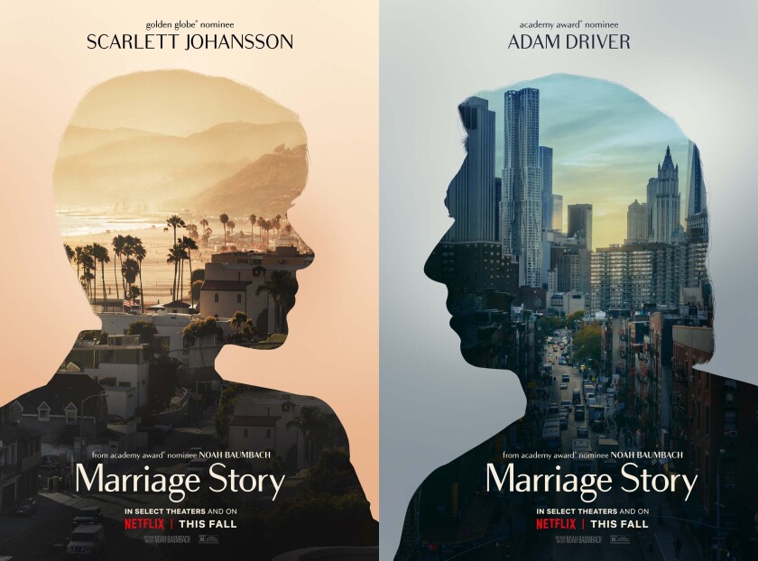
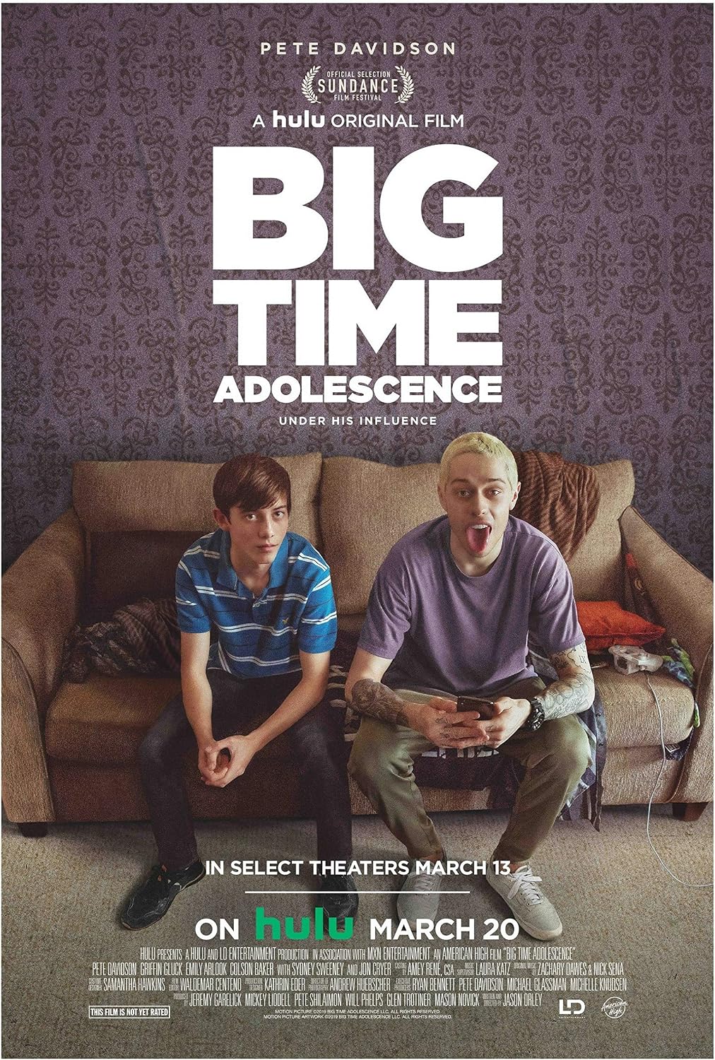
The two most important aspects of the production, from the perspective of marketing, were that it was a coming-of-age film and that it was a drama. While the idea was inspired and guided by my own experiences as a suburban teen, most of my research revolved around Marriage Story, a drama, and Big Time Adolescence, a coming-of-age movie. My research also included trends about social media analytics in order to effectively break conventions. Conventions noted from Marriage Story, which I chose due to its relatively mundane topic, were intimate shots and voiceovers. Big Time Adolescence showed a variety of visually interesting shots and the use of a specific color “look” to the film. The Suburbia trailers incorporate these elements.

Due to limitations placed on the production due to the COVID-19 pandemic, what started out as an interpersonal drama had to be cut down to a more character-study-esque film. This involves a lack of interaction with other characters, which is characteristic of dramas. However, the nature of running away and being on one’s own helps cover this up slightly.

Suburbia is marketed as an independent coming-of-age drama film, and thus targets older teenagers and young adults, within the 16-35 age bracket. This is due to the more relatable nature of the topic. While the intended audience includes both men and women, I do acknowledge that it would attract more female viewers due to the gender of the lead as well as the genre.

The film promotion package is meant to create a brand that comes off as modern-day “indie,” which is developed through the costuming in the trailer, the obvious use of color grading, as well as the ostentatious use of color, particularly blue in the case of Suburbia, on the social media page and the movie poster. Instagram is the official social media page of the film, and its grid appearance is meant to mirror one of a typical alternative account, not just limited to film promotion accounts (for this project I used @cagedpixi on Instagram as one of my inspirations). These accounts have a cohesive look throughout every single post, which was carried out through the posts on the social media page.

The social media page admittedly breaks quite a few conventions, with the main ones I stuck to being the uploading of stills and of the trailers. However, films typically do not receive their own social media pages and are instead promoted through the social media page of the online distributor. As inspiration, I looked at Marriage Story’s Instagram, however it was mainly used as a promotional tool after the release of the film at festivals and promoted its accolades as a draw for audiences. With a lack of accolades and a festival debut, I approached the social media page as a method to achieve virality.

Attempting to go viral is the main method of marketing through the social media page. This meant creating posts that while not entirely related to the film, still had something to do with it while presenting it in a shareable, repostable manner. Engagement with these posts promotes the account as a whole. While I think the social media page works as a marketing tool, I do not think it’s as effective as it could have been in conjunction with how the film looks to create a cohesive brand.

The movie poster was created to closely mirror the aesthetic of the social media page as to continue with the consistency, as well as due to technical skill limitations. The composition of the poster was inspired by Marriage Story which had a pair of posters, one with each of the pain characters facing in the opposite directions. While the original plan was to have a pair of posters, weather conditions did not allow for a second set of pictures to be taken, so only a suburban version was taken and we were unable to take an “urban” one.

The movie poster encourages people to buy tickets to an online screening on the film’s website. This is directly inspired by A24’s production Minari. The coronavirus pandemic has irreparably changed film distribution and watching trends, and thus, creators must follow suit. A24 offered screenings in a virtual cinema, which is what Suburbia will do. Limited screenings at local theaters will not have the same effect as it had in the past. Due to its status as an independent film, Suburbia also does not have access to streaming platforms more established production companies do. However, due to the trend started by A24, these online screenings appear to be “indie” and fit in perfectly with the branding while also not cheapening the film by having its sole way to stream be on YouTube.

The film promotion project mainly focuses on a singular character: Nicole Benton. As a result, all representation is through her. While diversity would’ve been nice, particularly in an indie film that tends to attract more young and socially aware audiences, the use of a white character was intentional. Suburbs are the result of white flight and it would be disingenuous and inaccurate to the story I wanted to tell to use an actress of a different race. Also due to a lack of access to actors due to the coronavirus, Martina (who plays Nicole) was the person with the most availability, so it was an easy decision. The trailers represent suburban white teenagers as pretentious, bored with normal life, and reckless. And this is exactly the image I wanted to create. While not a pleasant one, I wanted to represent the lack of preparedness suburban teenagers have when it comes to facing “the real world,” as that is the moral of the movie.


Saturday, April 17, 2021

Trailers, Social, & Poster!

Trailers

https://drive.google.com/drive/folders/1gOhGMBgrJHVUfU7kL4wDVhwrfzYCQ0oo?usp=sharing

They are also available on the Instagram page through IGTV!


Social Media

https://www.instagram.com/suburbiafilm/


Poster

Click for higher resolution


Friday, April 16, 2021

A Reflection

To say this year has been rough would be an understatement. I feel like I could extend this sentiment to my project: a bit rough. While I'm overall pleased with the finished result that you see on my blog, I feel like I could've been a lot more with more time (who wouldn't agree with that?)

Some time was lost due to me going off medication and having to fix the aftermath of the ordeal, as well as after the death of my uncle. I feel like these were crucial times for planning and filming, however, I don't regret this lost time because it was important for me to process both of these events.

I'm very pleased with the social media page, as it is very visually engaging. I'll discuss more in my CCR regarding why I decided to break conventions in regards to the visuals I used. I also really like the trailers I produced, despite some audio issues (though, a major improvement from my previous projects). The poster is one area I'm not super pleased with. While cohesive with the rest of the marketing, I think I would've preferred to match it with the actual color grading of the movie. However, I used an adobe filter for the color grading and while I'm pretty good with photoshop, I'm not that good.

Saturday, April 10, 2021

Colors

I really like color grading. I think it's an important part of the film, if you mess up color, it messes with the tone of the piece. My phone has a nice camera and video set up, but I do have a bit of an issue: it oversaturates everything. It isn't a problem in day-to-day use, but for the purposes of the project, it means that I have to color grade in order to get the vibe that I want.

So, this is how I went about it:
  1. Import clips into premiere pro and go into color effects
  2. Adjust levels to create a good level of contrast and correct white balance if needed
  3. Play around with filters!
Below, I have screenshots of the clip I tested on with the different filters. I tried every single filter, but these are the ones I felt would fit with the vibe of the piece best.


While I like the last 3, I feel like they're too warm. I want the clips to look a little cold and sterile, so bringing out the blues in the shots would be better than bringing out the reds. The second one feels a bit flat as it gets rid of the depth of the black. So it was between the first and the third filter.

I ended up going with the Blue Matrix filter since it brings out the blues but doesn't oversaturate the greens in the shots. Since Weston is a very landscaped area, there are going to be a lot of greens in the shots. I want to make sure that the colors add to the trailers, not detract from it due to being obnoxious.

Thursday, April 8, 2021

Changing Locations on the Fly

Initially, I had planned a few shots to be filmed in a public restroom. However, Martina is 16 and her parents said we couldn't leave her residential community so... what her parents say goes (I would rather not have the police called on me for kidnapping).

While I originally planned to film in either a Publix bathroom (despite being a nicer grocery store, their bathrooms don't reflect this) or at the public restrooms in Gator Run park, which is right in the middle of Martina and I's neighborhoods.

None of these things exist in Martina's residential community, so we had to impromptu it. First, we considered using Martina's bathroom, but her bathroom is actually quite nice and it doesn't fit the vibe of the scene I had envisioned at all.

Then we remembered we're right by a golf course and those bathrooms are so.... soooooo bad.

So, that's a picture of the golf courses. Nice, right? Super well-manicured green (or whatever you call it, I don't play golf) However... the bathrooms are a nightmare.

Here they are on the outside, with my little brother pictured. We encountered a small issue being that the women's bathrooms were locked. However, the men's bathroom didn't even have a lock on it so Martina and I walked in and had Nico (my younger brother) guard the door in case any of the nearby golfers tried to interrupt our high-class film production.

I'm pretty pleased with how the clips turned out. This is a picture I accidentally took instead of pressing video record, but it's the same angle I ended up using. The mirror looks dirty and grungy (well, because it is) and the tiles on the wall had dents and chips in them. The lack of maintenance in these bathrooms both disturbed me and helped out my cause.

While we were on the green we took a few more extra unplanned clips just in case I wanted to use them in the trailers. It's always better to over film compared to having too little footage. Luckily since my younger brother was there, we had him act as a proto-crew member and had him carry around the duffle bad between locations.

One scene involved Martina lying on the grass, however, there was the sun in her eyes. This was our fun resolution for how to block the sunlight without having it look like a person's shadow: a funky little pose that would cast a shadow over her face.


Overall, despite some setbacks, I felt like we were able to overcome them without sacrificing the original plan.

Wednesday, April 7, 2021

Deciding on a Movie Poster

So, to start, I had a bit of a vision coming in about the poster and what I wanted it to look like. Obviously, Martina would be in it, however, I did want to capture a good amount of the background in the photo. Setting is very important to the overall movie and I wanted to make sure to reflect that.

So, let's take a look at the movies I researched near the beginning of this project.

Beautiful Boy
Marriage Story


Big Time Adolescence

So, the one that left the biggest impression on me is Marriage Story's. I felt super inspired to have a pair of posters, one that represented the suburban life and another that represented the more urban/on the run life that Martina's character experiences, especially since these two contrasts are a big crux of the film.

One poster would be Martina on the road, I have planned to shoot this picture by State Road 84 West since it's right next to the highway and lacks the more suburban flairs that Weston normally has. The other would be in a residential neighborhood in Weston, as this would add a certain vibe that's quite contrasting when compared to the freeway.

Today was a filming day, so I was able to get this shot of Martina. I got around 30 different pictures, so I'll have to go through and choose my favorite, however, this is a general idea of what I was aiming for and the results that I got.


The title of the film is Suburbia, so I did a few title mockups to see which would go best with the poster. I'm still unsure which to go with, but I wanted a heavy sans serif font.


The fonts obviously need some kerning, but it's a starting point.


Tuesday, April 6, 2021

I Had to Teach my Little Brother to Drive

So, there were a few shots that involved a moving car. Originally, I planned on bringing my older brother so that I wouldn't have to worry about driving and having someone film the shot for me. It would be my little brother manning the camera while I drove, and I had a few issues with that.

  1. I don't trust him to carry out my creative vision
  2. I get distracted very easily while driving, and because of #1, I would spend more time focused on whether he's getting the right shot instead of looking at the road (a bit of an issue when driving more than 15 mph)
However, my older brother has a life outside of this project and I can only make my little brother help me out. But, Nico (my younger brother) doesn't know how to drive. He has never been in the driver's seat. He doesn't even have his permit yet despite already being 16. His experience with driving has been watching me speed and making my mom's SUV drift while pulling into our neighborhood (I never said I was a good driver).

So if I wanted the car to be moving in the shots while also being able to film and make sure it would stop when needed... I would have to teach him how to drive. A little.

We found a relatively straight street for him to practice on and I gave him two rules.
  1. Under no circumstances do you press the gas pedal
  2. Foot stays on the break the entire time
So, I switched the gear into drive for him (I didn't trust him not to put us into reverse by accident) and had him hold the wheel straight and not press the gas. We moved extremely slow, however, it was movement! He then proceeded to thank me by brake checking the car while I had no seatbelt on. 

We had to work on his braking skills, however, we're set for the car scenes that I need to film!

Wednesday, March 10, 2021

Assessing Wardrobe

 Martina sent me a few pictures of what she had in her closet, so I'm going to go through and assess (with the limited view that I have into her closet) what we could possibly use.


So, here we have a variety of sweatshirts. While I personally like them, I'm not convinced that they would fit into the aesthetic I have planned for Martina's character (name to be decided at a later date!). The graphics they have on them are sport/travel-related, and while that could work, I don't think they'd be kitschy enough to seem like it fits into a thrift-based aesthetic.


Something that I would consider using would be like this sweater above. While still a sweatshirt, it has those kitschy elements that would make it look more grunge than other aesthetics. It also has the feature of the red layer underneath, which fits into the layering aesthetic I would like to incorporate.


Martina also has a collection of graphic tees. The one on the left fits perfectly into the type of "loud" t-shirts I was referring to in my previous blog post. The one on the right, while still a graphic tee, doesn't quite fit into the aesthetic I have envisioned. Disney, with the exception of Nightmare Before Christmas, feels like it clashes with the rebellious character we're trying to convey through her character.


This section of Martina's closet seems to fit another aesthetic. However, I don't mind reaching into it for a plain black shirt we can use to layer. I don't have much to add here.


These shirts feel perfect! I'm pretty sure the top of the stack on the right is a shirt with dolphins on it, which not only do I personally love, would fit in with the thrift-based aesthetic I'm trying to build with Martina's character. It looks slightly outdated in the sense that it's a very 2000s shirt, so you would hardly see a more mainstream trendy teen wearing it. I'll have to explore this section more in person.


Again, not much to add. The shoes are all on-trend and all trendy amongst more alternative style teens. Martina also has a studded belt, as you can see at the very top in the photo. This is also a super popular trend from the early 2000s that has made a comeback amongst trendy alternative teens. I'll see if I can incorporate it as necessary.


Martina also owns these pairs of jeans. Not much to add other than they're exactly what I wanted as I outlined in my last post


Now... this? This is precisely what I had in mind. It's so perfect!

It warrants a celebratory GIF.

Anyways, this fits into the aesthetic I'm trying to craft perfectly. If the bottom right shirt with the skull doesn't make it into the final cut of my trailers, please check in on me, because it means that I am not ok.


And to finish off, this is what Martina has on her hangers. She has a flannel and a few more pants. Nothing I necessarily feel the need to comment, but I really do think that this will fit into the aesthetic I am building surrounding her character.

Tuesday, March 9, 2021

Why Martina? And a Look into What Grunge Even Is

 So, this is Martina!


As you can tell, Martina already has a personal brand that fits in with the character type I want to do. She has the grunge/thrift teen aesthetic I want to create with my character. This means that I don't have to spend any money buying clothes or track someone down that's Martina's size.

But what does a grunge aesthetic even consist of?

From the Wikipedia page (yes, I use Wikipedia!):

Grunge fashion is the clothing, accessories and hairstyles of the grunge music genre and subculture which emerged in mid-1980s Seattle, and had reached wide popularity by the early 2000s. Grunge fashion is characterized by durable and timeless thrift-store clothing, often worn in a loose, androgynous manner to de-emphasize the silhouette. The style was popularized by music bands Nirvana, Soundgarden and Pearl Jam.

So, as part of my research, I looked up "grunge" on Pinterest and saved a few pins that I wanted to take inspiration from. (Check out what I found here) Some of what I saved is very much not grunge, but it reflects how that general type of alternative subculture of teens is dressing these days. Sticking to what would be considered strictly grunge would most likely result in an outdated wardrobe, which while not necessarily an issue, doesn't feel too realistic of what a suburban teen would wear.

The main reason I wanted to go with more of an internet girl influence is that it would be realistic for the modern teen; this movie isn't going to be set in the past. It's pretty well known that TikTok is setting trends, especially among teens

Elements I would like to include are:

  • Band tee shirts
  • Graphic tees with generally "aggressive" prints
    • Aggressive meaning loud, with lots of primary colors, and intense imagery (such as skulls)
  • Ripped, baggy jeans
  • Flannel
  • Loose layers and clothing in general
    • The androgynous style and lack of a silhouette is an important part of grunge fashion, and it definitely has carried on to the modern day. It would be a mistake not to include this aspect.
While I don't necessarily think I have to include all of these aspects, I think it would be interesting to have and it's definitely the vision I have for the costuming.

So, I'm using Martina because she already has these things in her closet and her dyed hair adds another element without me having to explain to an angry parent why their kid came home with different-colored hair.

Monday, March 8, 2021

Telling Martina The New Plan

So, I honestly still wanted to make my chick flick because I did the research and thought it would be cute </3

But Martina and I both don't like kissing randoms, so I decided to go with the more grungey coming of age film. I think this is a lot easier for me to accomplish with the restraints I have. While I could possibly ask my friend Soha to be the star, her relationship is kind of rocky right now and it requires me completely finishing ALL filming in 4 days. I don't think that's a limitation I would like to place on myself, so this seems like the right way forward!


So, when I originally told Martina about the plan, I was very much thinking about Beautiful Boy, hence the idea for the grunge movie involving drug use. However, this isn't really the path I want to go with anymore, so disregard the comment!


Anyways, Martina is on board! A post about why I chose her will be going up soon.

Thursday, March 4, 2021

AHHHHHHHHH!

Turns out that David's girlfriend doesn't want to do the trailers. This throws an absolute wrench in my plans. Time to completely change what I had planned!

I had a bit of a backup plan, which I discussed with the class yesterday. While Martina has no one to kiss, she does have a cool closet that's pretty grungy and gives me teenage runaway vibes. My idea is to take her up and down State Road 84 and film a teenage runaway film. 

The basic premise is a teenager who gets tired of her suburban life and chooses to run away towards the city as a result. However, she realizes that she made a mistake and is now somewhere where she can't get back and isn't safe.

While the movie is probably not related in the slightest, I got the idea from Beautiful Boy because I think I'd like to have similar vibes to the "my son is a drug addict" drama.

Here is the trailer for Beautiful Boy. I want to make something that feels a bit gritty and realistic, which is the main reason my mind wandered to Beautiful Boy.

I feel like the trailer is a good example of how to demonstrate an interpersonal drama in a compelling way and I like the way it's set up with the arguments and the shots of each of them going through their own problems. While I was initially very opposed to having a voiceover, I don't think that it's that bad of an idea after watching this trailer.

I also checked out the trailer for Marriage Story since it came up on my YouTube recommended after the Beautiful Boy trailer. It's another realistic, popular, drama that involves interpersonal relationships, so it's worth looking into.

https://www.youtube.com/watch?v=FDFdroN7d0w&list=TLPQMTEwMzIwMjEhEydLwcfMOw&index=2

So, this was a really interesting take on a trailer. It's just a scene from the movie, and it's arguably the climax. And they just... made it the trailer. I'm not sure I want to take this route to be honest, as I don't know if it would be the best method of showing technique. However, since we're doing a pair of trailers and not just one, I think it could be an interesting way to produce just one of them, by having the scene between the daughter and the mother arguing. I think I'd have to recruit my mom into being my actress, so we'll see.

I also found the trailer for an indie drama about adolescence, which is something definitely worth looking into. While it definitely wasn't a box office hit, I am making an indie drama about adolescence so it's a pretty good example to look at. It deals with a teen boy, not a teen girl, but I could get some ideas for color grading and trailer structure out of it.


I think it's pretty interesting. I like how dark the movie is, not in a tone sense, but in the literal color grading and lighting sense.

Wednesday, March 3, 2021

Kissing During a Pandemic

So all of my friends that were in relationships broke up. That kinda throws a wrench in my plans because I need people to kiss in my trailers. So, I turned to Twitter to see if any of my 57 followers could help me out.

Unfortunately, my little brother's friends are lonely too.


I broke up with my ex-boyfriend like two months ago and I think it'd be messier than it's worth trying to involve him in helping me out. Plus, I simply do not want to, which I think is a good enough excuse to not do anything.

I could give up and turn my trailers into a film about a cute kitty romance involving my cat, Pikachu, but he's mean and doesn't like other cats and I'm not very well trained in the art of animal training. It's unfortunate, I think Pikachu makes quite the handsome leading man.


So, I got to texting people individually if they could help me out by acting in my trailers. I sent the following text:
"1. is there someone who is willing to kiss you on the mouth?
2. if so, could you act in a trailer for me?"

I got the following responses...

Matheus:

Camille:
But then I realized my friend David is literally in a relationship and his girlfriend is very nice. After asking if they would act in my trailer, David told me that he'd ask but it'd probably be a yes! I'm very excited and by knowing their vibes, I know I can more properly develop a story. I think that writing the role specifically for someone is much easier than writing the role and trying to find two people that fit into that role.

Tuesday, March 2, 2021

Funky Costumes?

 So I was scrolling Twitter (as one does) and I came across this tweet that really piqued my interest. Here it is below:

I really like this as a look. The monochromatic for each character is definitely something I could incorporate, especially if I decide to go for a more whimsical childhood-based storyline like some of the color palettes inspired me to.

I'm also tempted to use a funky hat. I feel like I could have a lot of fun by incorporating a frog hat. I don't know how serious I am about this idea, but I definitely think it could be fun, funky, and fresh.

On a more serious note, I think I'm liking the following color palette for costuming. We'll see how it goes once I figure out who I can get to act in my trailers.