Get ready for a really long blog post. So, for part of our opening, I wanted to incorporate a hologram of our character using a dating app. Except I can't just use Tinder. Not only would I then have to get written permission from everyone who shows up, but I'm pretty sure I'm not allowed to use Tinder's design without written permission. And that'd be rather complicated... and also boring!
I really want to get into graphic design so this is a really fun chance to hone my skills and really push myself to make something I've never made before. Of course, I'll be taking inspiration from previous dating apps.
So first, I got to choosing which font to use for the logo and emailed all creators whose fonts I was interested in to get written permission to use it. Also, full disclosure, I love close kerning so all of these letters are gonna be close together.
The first font I was looking at was Leona created by Jay Hooper. I liked how simple it was and how it looked clean. It's not overtly sci-fi, but I feel like the soft curves in the letter do imply that. Here's the font and written permission below!

The dating app and our film is going to be called Flame, which just FEELS like a dating app name and also has the cute addition of meaning someone you like. Use Flame to find your next fling!

Anyways, this is what I came up with for the Leona font.

I like it. But I don't love it. I loved how the font name looked but I don't know how much I actually love it now that it's our app name. Robert, however, likes the vibe it gives off and thinks it feels accurate to what retrofuturism looks like.
The next font is Robota by RC Graphics. It looked really futuristic to me and the picture that they used to show off the font really drew me in.
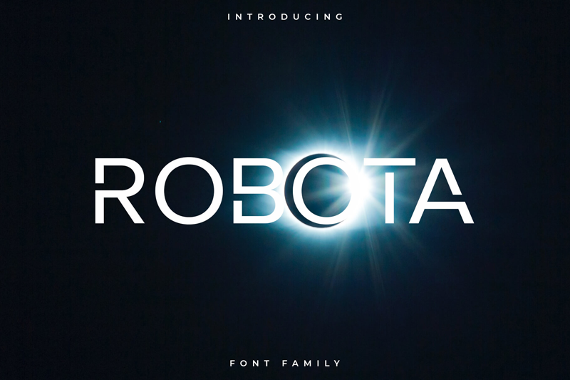
Just look at that! It's so cool! Anyways, the advertising really got me so I emailed the creators in order to get written permission to use the font. I know that this falls under personal use, technically. But I really don't want to mess up by using a font when the owner expects me to pay for a license. So while there are a lot of permissions on this post, I find them necessary to help me navigate the complicated world of copyrights.
Anyways, this font only comes in uppercase letters so I don't have as many options as I did with the Leona font.

Robota doesn't look as good I think. At least that's what Robert thinks. I'm kind of inclined to agree with him. While I think the font could be cool as maybe our title, I don't really think it fits into the use of being a dating app logo. It feels too aggressive.
Onto the next font! I found Neue Metana by Dirtyline Studio and kind of fell in love. It's a really cool font and it just feels old. While it lacks some of the more futuristic aspects, I just liked it way too much to not give it a shot.

Robert really likes the top one and god, I agree. I literally love it so much. This font gives me so much inspiration I literally want to throw the current UI draft I have away. It's trash and this font has shown me the light! But I have one more font left so...
Alterner by Jack Thompson was really cool! While it doesn't seem like the most futuristic or retro font, I really really want to give it a chance. I just feel drawn to it.

I'm really upset. I love this font and designer but I don't think it's the one we're going to go with. Robert doesn't love it and I don't think it fits with what we're trying to do.
So... Neue Metana it is! While I could go into Illustrator and play around with the logo, I think that it's fine as is. So onto the actual UI!
I decided to base the design off of advertisements from the 1950s. They certainly didn't have dating apps at the time. Initially, I was going to take a very modern approach, but I'm not super sure if that really propels the old-but-new feeling Robert and I wanted to invoke. It's right below!
via GIPHY
So here's some of the inspiration that I found and compiled on Pinterest! But I want to show one in particular that I really enjoyed the color story of.

The eyedropper tool and I are about to be best friends! While I didn't love my old design I do think that the actual "design" and not the color part is really cool. So I'm going to revisit the old design and give it a bit of a facelift!
So here are the color palettes I came up with. I used Adobe Capture to make all of them.


The last one is my favorite. I'm gonna build off of that and get to designing! I took the previous design and built off of it. I ended up not using the orange, but that's ok but I like how the colors came out. Here's a gif of the process!
via GIPHY
To be honest... I kind of hate it. It's flat and boring and I wish it had more oomph. After consulting with a friend, we realized that I was missing any texture. It was flat because it's literally flat.
By the time I loaded up a tutorial on how to create a paper texture, I realized I should try to look at how it looked as a hologram. And it looked fine! So that's my final design.
No comments:
Post a Comment